How did words guide my ride
Where to? Or.. Where are you going?
Imagine a rush hour in a buzzing city, and I’m scrambling to book a ride to get back home. I instinctively turn to Uber and I read “Where to?“ – how quick and efficient! But it got me thinking: how do word choice shape the way I ride? So I took a closer look comparing Uber and Lyft, their tone, labels, microcopy.
First impressions - warm or direct?
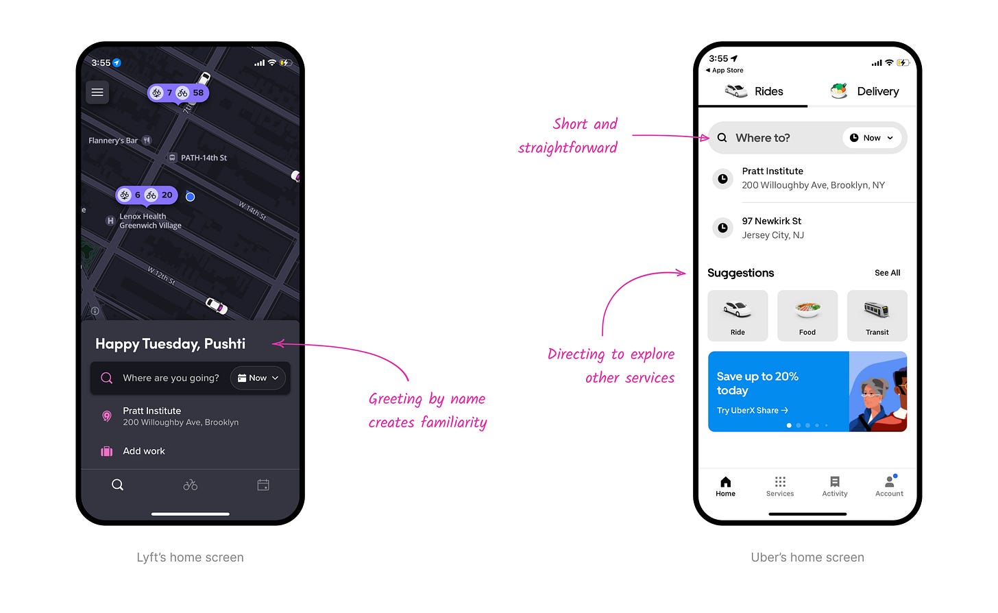
Lyft welcomes you with a personal touch—“Happy Tuesday, Pushti”, using your name to build a friendly, almost conversational tone. The search bar adds to this warmth by asking, "Where are you going?" It feels like Lyft is talking to you.
Uber, meanwhile, cuts straight to the point. No greetings, no fluff. Just a sharp, action-ready "Where to?" It feels more like a tool you can rely on when you're in a hurry—efficient but less personal.
Choosing a ride - long or short descriptions
Uber keeps things short and to the point with labels like ‘Popular’ and ‘Economy’, while the descriptions highlight key perks to help you decide. It works well, its clear and efficient. But one label threw me off: ‘Connect’. With a description about “standard packages up to 30lbs,” it felt more like a courier service than a ride option, adding noise to the list of ride options.
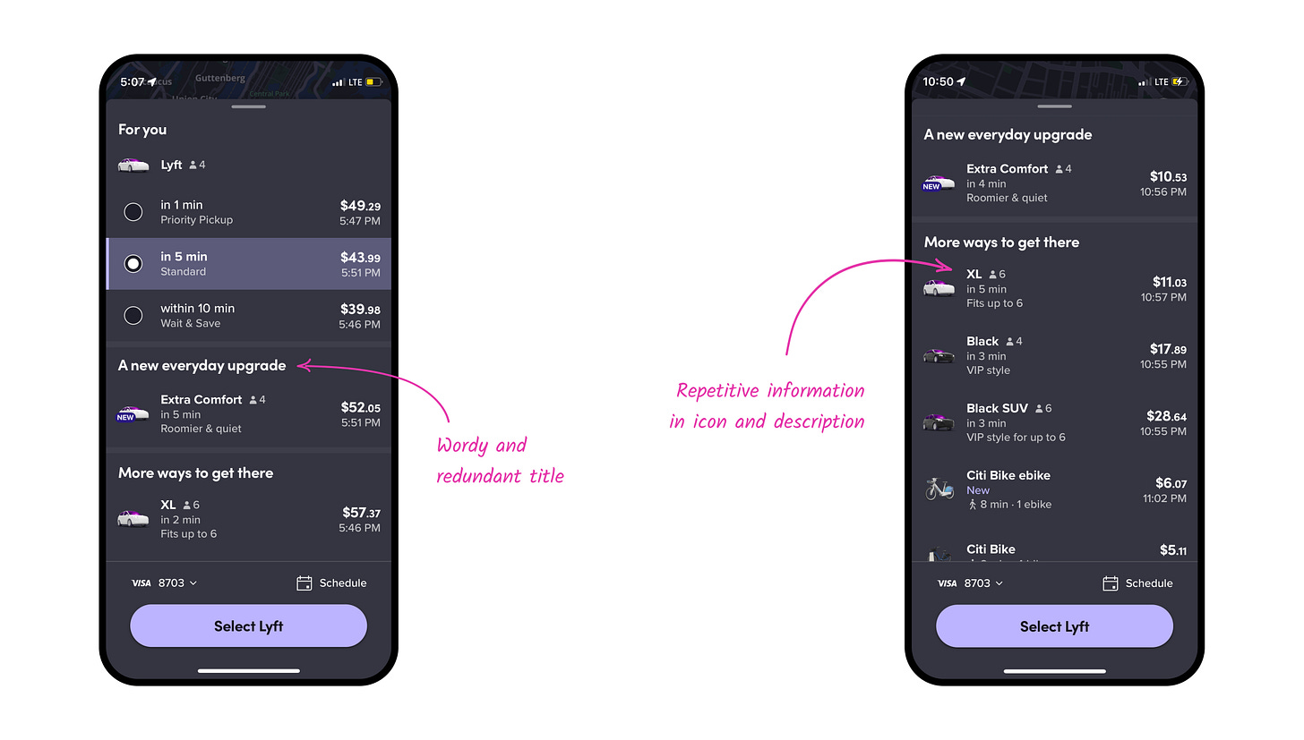
Lyft’s ride options feel a little more laid-back and less crowded. They use longer titles like ‘A new everyday upgrade’ and ‘More ways to get there’, which sound friendly but sometimes feel a bit wordy. For example, ‘A new everyday upgrade’ could be shortened to ‘Upgrade picks.’ Another example - the XL ride says Fits up to 6 in the description, but there’s also an icon showing six people right next to it – that felt a bit repetitive.
Cancellation: uniform or user-centric labels
When you cancel a ride, Uber’s labels use a parallel grammatical structure. Short, action-verbs like 'requested' or 'selected.' This also brings visual harmony, accompanied by icons.
Lyft’s labels feel more conversational and user-centric, like ‘Driver asked me to cancel’ or ‘Someone took my ride.’ They sound like something I would actually say. But sometimes the phrasing is a little too casual. ‘Can’t accommodate me’ is an example—it makes you pause for a second to figure out who it’s referring to.
Book in advance: exclusivity or routine?
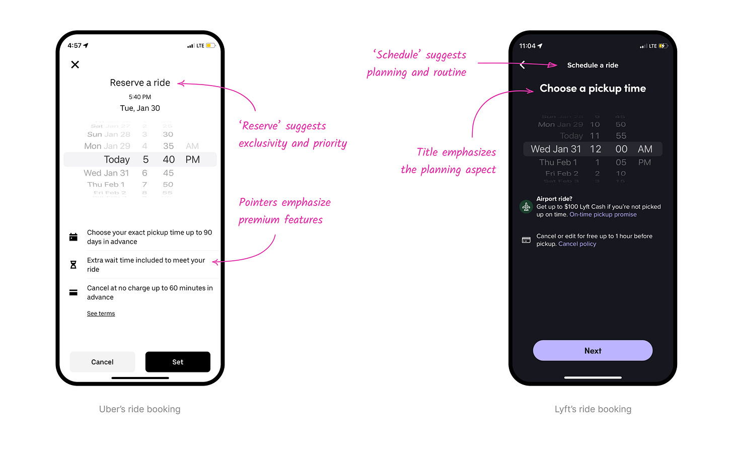
I also noticed a small difference in how the apps talk about booking a ride in advance. Uber says ‘Reserve a ride’, which feels a bit more exclusive—like you're locking something in with priority. The description even mentions ‘extra wait time’ to meet your ride, which makes it feel a bit more premium.
On the other hand, Lyft uses ‘Schedule a ride’ which feels more about planning ahead, like setting up a regular trip. Lyft leans into that idea with a heading that says ‘Choose a pickup time’, which makes the experience feel a bit more routine and organized.


